vue组件化实践
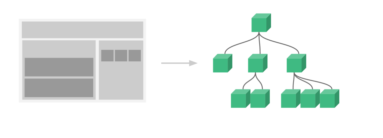
组件化
vue组件系统提供了一种抽象,让我们可以使用独立可复用的组件来构建大型应用,任意类型的应用界 面都可以抽象为一个组件树。组件化能提高开发效率,方便重复使用,简化调试步骤,提升项目可维护 性,便于多人协同开发。
组件通信常用方式
1. props
父给子传值
    // child
    props: { msg: String }
    // parent
    <HelloWorld msg="Welcome to Your Vue.js App"/>
2. 自定义事件
子给父传值
    // child this.$emit('add', good)
    // parent
    <Cart @add="cartAdd($event)"></Cart>
3. 事件总线
任意两个组件之间传值常用事件总线 或 vuex的方式。
      // Bus:事件派发、监听和回调管理 class Bus {
    constructor(){ this.callbacks = {}
      }
      $on(name, fn){
    this.callbacks[name] = this.callbacks[name] || []
    this.callbacks[name].push(fn) }
    $emit(name, args){ if(this.callbacks[name]){
    this.callbacks[name].forEach(cb => cb(args)) }
    } }
    // main.js
    Vue.prototype.$bus = new Bus()
    // child1
    this.$bus.$on('foo', handle) // child2 this.$bus.$emit('foo')
实践中通常用Vue代替Bus,因为Vue已经实现了相应接口
4. vuex
创建唯一的全局数据管理者store,通过它管理数据并通知组件状态变更。
5. $parent/$root
兄弟组件之间通信可通过共同祖辈搭桥,
$parent或$root。
    // brother1
    this.$parent.$on('foo', handle)
    // brother2
    this.$parent.$emit('foo')
6. $children
父组件可以通过
$children访问子组件实现父子通信。
     // parent
     this.$children[0].xx = 'xxx'
7. $attrs/$listeners
包含了父作用域中不作为 prop 被识别 (且获取) 的特性绑定 ( class 和 style 除外)。当一个组件没有 声明任何 prop 时,这里会包含所有父作用域的绑定 ( class 和 style 除外),并且可以通过
v- bind="$attrs"传入内部组件——在创建高级别的组件时非常有用。
    // child:并未在props中声明foo
    <p>{{$attrs.foo}}</p>
    // parent
    <HelloWorld foo="foo"/>
8. refs
获取子节点引用
    // parent
    <HelloWorld ref="hw"/>
    mounted() {
      this.$refs.hw.xx = 'xxx'
    }
9. provide/inject
能够实现祖先和后代之间传值
    // ancestor
    provide() {
      return {foo: 'foo'}
    }
    // descendant
    inject: ['foo']
实例
    // index.vue
    <template>
      <div>
        <h2>组件通信</h2>
        <!-- props, 自定义事件 -->
        <Child1 msg="some msg from parent" @some-event="onSomeEvent"></Child1>
        <!-- 事件总线 -->
        <Child2 msg="other msg"></Child2>
      </div>
    </template>

    <script>
      import Child1 from '@/components/communication/Child1.vue'
      import Child2 from '@/components/communication/Child2.vue'

      export default {
        components: {
          Child1, Child2,
          // Child3: () => import('./Child3.vue')
        },
        methods: {
          onSomeEvent(msg) {
            console.log('Communition:', msg);
          }
        },
        mounted () {
          // $children持有所有自定义组件
          // 它不保证顺序
          console.log(this.$children);
        },
      }
    </script>

    <style scoped>

    </style>
    // child1.vue
    <template>
      <div @click="$emit('some-event', 'msg from child1')">
        <h3>child1</h3>
        <p>{{msg}}</p>
      </div>
    </template>

    <script>
      export default {
        props: {
          msg: {
            type: String,
            default: ''
          },
        },
        mounted () {
          // this.$bus.$on('event-from-child2', msg => {
          //   console.log('Child1:', msg);
          // });
          this.$parent.$on('event-from-child2', msg => {
            console.log('Child1:', msg);
          });
        },
      }
    </script>

    <style scoped>

    </style>
    // child2.vue
    <template>
      <div>
        <!-- 展开$attrs对象 -->
        <h3 v-bind="$attrs">child2</h3>
        <button @click="sendToChild1">给child1发送消息</button>
        <!-- $attrs -->
        <p>{{$attrs.msg}}</p>
        <!-- inject -->
        <p>{{foo}}</p>
      </div>
    </template>

    <script>
      export default {
        inheritAttrs: false,
        inject: ['foo'],
        methods: {
          sendToChild1() {
            // 利用事件总线发送事件
            // this.$bus.$emit('event-from-child2', 'some msg from child2')
            this.$parent.$emit('event-from-child2', 'some msg from child2')
          }
        },
      }
    </script>

    <style scoped>

    </style>
插槽
插槽语法是Vue 实现的内容分发 API,用于复合组件开发。该技术在通用组件库开发中有大量应用
1. 匿名插槽
    // comp1
    <div>
      <slot></slot>
    </div>
    // parent
    <comp>hello</comp>
2. 具名插槽
将内容分发到子组件指定位置
    // comp2
    <div>
    <slot></slot>
    <slot name="content"></slot>
    </div>
    // parent
    <Comp2>
    <!-- 默认插槽用default做参数 -->
    <template v-slot:default>具名插槽</template> <!-- 具名插槽用插槽名做参数 -->
    <template v-slot:content>内容...</template>
    </Comp2>
3. 作用域插槽
分发内容要用到子组件中的数据
    // comp3
    <div>
    <slot :foo="foo"></slot>
    </div>
    // parent
    <Comp3>
    <!-- 把v-slot的值指定为作用域上下文对象 --> <template v-slot:default="slotProps"> 来自子组件数据:{{slotProps.foo}} </template>
    </Comp3>
范例
    // 子组件 Layout.vue
    <template>
      <div>
        <div class="header">
          <slot name="header"></slot>
        </div>
        <div class="body">
          <slot></slot>
        </div>
        <div class="footer">
          <slot name="footer" :fc="footerContent"></slot>
        </div>
      </div>
    </template>

    <script>
      export default {
        data() {
          return {
            remark: [
              '好好学习,天天向上',
              '学习永远不晚',
              '学习知识要善于思考,思考,再思考',
              '学习的敌人是自己的满足,要认真学习一点东西,必须从不自满开始',
              '构成我们学习最大障碍的是已知的东西,而不是未知的东西',
              '在今天和明天之间,有一段很长的时间;趁你还有精神的时候,学习迅速办事',
              '三人行必有我师焉;择其善者而从之,其不善者而改之'
            ]
          }
        },
        computed: {
          footerContent() {
            return this.remark[new Date().getDay() - 1]
          }
        },
      }
    </script>

    <style scoped>
    .header {
      background-color: rgb(252, 175, 175);
    }
    .body {
      display: flex;
      background-color: rgb(144, 250, 134);
      min-height: 100px;
      align-items: center;
      justify-content: center;
    }
    .footer {
      background-color: rgb(114, 116, 255);
    }
    </style>
    //父组件 index.vue
    <template>
      <div>
        <h2>插槽</h2>
        <!-- 插槽 -->
        <Layout>
          <!-- 具名插槽 -->
          <template v-slot:header>全栈工程师</template>
          <!-- 匿名插槽 -->
          <template>content...</template>
          <!-- 作用域插槽 -->
          <template v-slot:footer="{fc}">{{fc}}</template>
        </Layout>
      </div>
    </template>

    <script>
      import Layout from '@/components/slots/Layout.vue'

      export default {
        components: {
          Layout
        },
      }
    </script>

    <style scoped>

    </style>
组件化实战
通用表单组件
收集数据、校验数据并提交。
实现KForm 指定数据、校验规则
KformItem
- label标签添加
- 执行校验
- 显示错误信息
KInput
- 维护数据
    <template>
      <el-form :model="userInfo" :rules="rules" ref="loginForm">
        <el-form-item label="用户名" prop="name">
          <el-input v-model="userInfo.name"></el-input>
        </el-form-item>
        <el-form-item label="密码" prop="password">
          <el-input v-model="userInfo.password" type="password"></el-input>
        </el-form-item>
        <el-form-item>
          <el-button @click="login">登录</el-button>
        </el-form-item>
      </el-form>
    </template>

    <script>
    export default {
      data() {
        return {
          userInfo: {
            username: "",
            password: ""
          },
          rules: {
            username: [{ required: true, message: "请输入用户名称" }],
            password: [{ required: true, message: "请输入密码" }]
          }
        };
      },
      methods: {
        login() {
          this.$refs["loginForm"].validate(valid => {
            if (valid) {
              alert("submit");
            } else {
              console.log("error submit!");
              return false;
            }
          });
        }
      }
    };
    </script>

    <style scoped>
    </style>
**1. **KInput
    // 创建components/form/KInput.vue
    <template>
      <div>
        <!-- 管理数据:实现双绑 -->
        <!-- :value, @input -->
        <input :type="type" :value="value" @input="onInput"
          v-bind="$attrs">
      </div>
    </template>

    <script>
      export default {
        inheritAttrs: false , // 关闭特性继承
        props: {
          value: {
            type: String,
            default: ''
          },
          type: {
            type: String,
            default: 'text'
          }
        },
        methods: {
          onInput(e) {
            this.$emit('input', e.target.value)

            // 值发生变化的时候就是需要校验的时候
            this.$parent.$emit('validate')
          }
        },
      }
    </script>

    <style scoped>

    </style>
- 使用KInput
创建components/form/index.vue,添加如下代码:
    <template>
      <div>
    <h3>KForm表单</h3>
    <hr>
    <k-input v-model="model.username"></k-input>
    <k-input type="password" v-model="model.password"></k-input>
      </div>
    </template>
    export default {
      components: {
      KInput
    },
      data() {
       return {
          model: { username: "tom", password: "" },
        };
      }
    };
    </script>
- 实现KFormItem
创建components/form/KFormItem.vue
    <template>
      <div>
        <!-- label标签 -->
        <label v-if="label">{{label}}</label>
        <!-- 容器,放插槽 -->
        <slot></slot>
        <!-- 错误信息展示 -->
        <p v-if="error" class="error">{{error}}</p>
      </div>
    </template>

    <script>
      import Schema from 'async-validator'

      export default {
        inject: ['form'],
        data() {
          return {
            error: ''
          }
        },
        props: {
          label: {
            type: String,
            default: ''
          },
          prop: {
            type: String,
            default: ''
          }
        },
        mounted () {
          // 监听校验事件
          this.$on('validate', () => {
            this.validate()
          })
        },
        methods: {
          validate() {
            // 执行校验
            // 1.获取值和校验规则
            const rules = this.form.rules[this.prop]
            const value = this.form.model[this.prop]

            // 2.执行校验:使用官方也使用的async-validator
            // 创建描述对象
            const descriptor = {[this.prop]:rules}
            // 创建校验器
            const validator = new Schema(descriptor)
            // 执行校验
            return validator.validate({[this.prop]:value}, errors => {
              // 如果errors存在,则说明校验失败
              if (errors) {
                this.error = errors[0].message
              } else {
                this.error = ''
              }
            })
          }
        },
      }
    </script>

    <style scoped>
    .error{
      color: red
    }
    </style>
- 使用KFormItem
components/form/index.vue,添加基础代码:
    <template>
      <div>
    <h3>KForm表单</h3>
    <hr>
    <k-form-item label="用户名" prop="username">
    <k-input v-model="model.username"></k-input> </k-form-item>
    <k-form-item label="确认密码" prop="password">
    <k-input type="password" v-model="model.password"></k-input>
    </k-form-item> </div>
    </template>
- 实现KForm
    <template>
      <div>
        <!-- 容器:存放所有表单项 -->
        <!-- 存储值载体:保存大家数据和校验规则 -->
        <slot></slot>
      </div>
    </template>

    <script>
    // 我们平时写的组件是一个组件配置对象
    export default {
      provide() {
        return {
          // 直接把当前组件实例传递下去
          // 传递下去的对象是响应式的则还可以响应式
          form: this
        };
      },
      props: {
        // 数据模型
        model: {
          type: Object,
          required: true
        },
        rules: Object
      },
      methods: {
        validate(cb) {
          // 遍历肚子里面的所有FormItem,执行他们的validate方法
          // 全部通过才算通过
          // tasks是校验结果的Promise组成的数组
          const tasks = this.$children
            .filter(item => item.prop)
            .map(item => item.validate());
          // 统一判断
          Promise.all(tasks)
            .then(() => cb(true))
            .catch(() => cb(false));
        }
      }
    };
    </script>

    <style scoped>
    </style>
- 使用KForm
components/form/index.vue,添加基础代码:
    < template > <div > <h3 > KForm表单 < /h3>
    <hr>
    <k-form :model="model" :rules="rules" ref="loginForm">
    ...
    </k - form > </div>
    </template > <script > import KForm from "./KForm";
    export default {
            components:
            {
                KForm,
            },
            data() {
                return {
                    rules: {
                        username: [{
                            required: true,
                            message: "请输入用户名"
                        }],
                        password: [{
                            required: true,
                            message: "请输入密码"
                        }]
                    }
                };
            },
            methods: {
                submitForm() {
                    this.$refs['loginForm'].validate(valid = >{
                        if (valid) {
                            alert("请求登录!");
                        } else {
                            alert("校验失败!");
                        }
                    });
                }
            }
        }; < /script>/
- 数据校验
Input通知校验
    onInput(e) { // ...
        // $parent指FormItem
        this.$parent.$emit('validate');
    }
FormItem监听校验通知,获取规则并执行校验
    inject: ['form'],
    // 注入 mounted(){// 监听校验事件
    this.$on('validate', () = >{
        this.validate()
    })
    },
    methods: {
        validate() {
            // 获取对应FormItem校验规则 console.log(this.form.rules[this.prop]);
        }
    },
    import Schema from "async-validator";

    validate() {
        // 获取对应FormItem校验规则
        const rules = this.form.rules[this.prop];
        // 获取校验值
        const value = this.form.model[this.prop];
        // 校验
        const schema = new Schema(descriptor);
        // 返回Promise,没有触发catch就说明验证通过
        return schema.validate({ [this.prop] : value
        },
        errors = >{
            if (errors) {
                // 将错误信息显示
                this.error = errors[0].message;
            } else {
                // 校验通过 this.error = "";
            }
        });
    }
表单全局验证,为Form提供validate方法
    validate(cb) {
        // 调用所有含有prop属性的子组件的validate方法并得到Promise数组 const tasks = this.$children
        .filter(item = >item.prop).map(item = >item.validate());
        // 所有任务必须全部成功才算校验通过,任一失败则校验失败
        Promise.all(tasks).then(() = >cb(true)).catch(() = >cb(false))
    }
实现弹窗组件
弹窗这类组件的特点是它们在当前vue 实例之外独立存在,通常挂载于body;它们是通过JS动态创建的,不需要在任何组件中声明。常⻅使用姿势
    this.$create(Notice, {
        title: '喊你来搬砖',
        message: '提示信息',
        duration: 1000
    }).show();
create函数
    import Vue from "vue";
    // 创建函数接收要创建组件定义
    function create(Component, props) {
        // 创建一个Vue新实例 const vm = new Vue({
        render(h) {
            // render函数将传入组件配置对象转换为虚拟dom console.log(h(Component, { props })); return h(Component, { props });
        }
    }).$mount(); //执行挂载函数,但未指定挂载目标,表示只执行初始化工作

      // 将生成dom元素追加至
      body document.body.appendChild(vm.$el);

      // 给组件实例添加销毁方法
      const comp = vm.$children[0];
      comp.remove = () = >{
          document.body.removeChild(vm.$el);
          vm.$destroy();
      };
      return comp;
    }
    // 暴露调用接口
    export default create
另一种创建组件实例的方式:
Vue.extend(Component)
通知组件
建通知组件,Notice.vue
    <template>
      <div class="box" v-if="isShow">
        <h3>{{title}}</h3>
        <p class="box-content">{{message}}</p>
      </div>
    </template>

    <script>
    export default {
      props: {
        title: {
          type: String,
          default: ""
        },
        message: {
          type: String,
          default: ""
        },
        duration: {
          type: Number,
          default: 2000
        }
      },
      data() {
        return {
          isShow: false
        };
      },
      methods: {
        show() {
          this.isShow = true;
          setTimeout(this.hide, this.duration);
        },
        hide() {
          this.isShow = false;
          this.remove();
        }
      }
    };
    </script>

    <style>
    .box {
      position: fixed;
      width: 100%;
      top: 16px;
      left: 0;
      text-align: center;
      pointer-events: none;
      background-color: #fff;
      border: grey 3px solid;
      box-sizing: border-box;
    }
    .box-content {
      width: 200px;
      margin: 10px auto;
      font-size: 14px;
      padding: 8px 16px;
      background: #fff;
      border-radius: 3px;
      margin-bottom: 8px;
    }
    </style>
阅读全文